


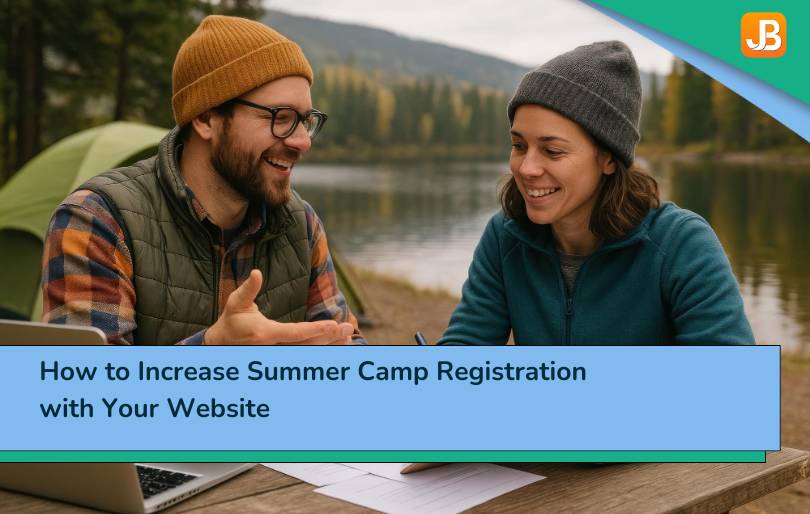


Key Takeaways
Website as your registration engine
A well-designed camp website is more than information—it drives registrations by providing a clear, user-friendly path from discovery to “Register Now”.
Clear value and unique identity attract families
Highlight what makes your camp different (themes, activities, staff, results) so families easily decide you’re the right fit—leading to less hesitation and faster enrollments.
Optimize for mobile, speed & search
Fast load times, mobile-friendly layouts, SEO-optimized headlines and proper keywords ensure your site shows up in searches and works smoothly for users on any device.
Seamless registration integration reduces barriers
A website connected to camp registration software, easy forms, clear pricing, and transparent next steps cuts friction and converts more interest into actual registrations.
To increase summer camp registration through your website, start by seeing the page the way a parent does. Promotion is not just about getting traffic; it depends on clear information, visible trust signals, and simple next steps.
Parents need to find organized program listings by age, session dates, and location, real testimonials from families and returning campers, photos and videos that show the actual camp experience, clear calls to action near key decision points, and a site that is optimized for search and local discovery so the right families can find you.
A well-structured camp website answers common questions upfront, reduces hesitation, and helps parents make decisions without extra emails or phone calls. In the next section, we will look at what needs to be visible the moment a parent lands on your site—and why that first impression directly affects registrations.
Design for Conversion: What Parents Need to See Above the Fold
Parents do not browse—they scan. In the first few seconds on your homepage or program page, they are deciding: Is this camp a good fit for my child, and can I trust it?
If you want to increase summer camp registration with the website, your design must guide that decision quickly and clearly, especially above the fold.
Here is how to make that space work harder:
Mobile-First Design and Fast Load Times
According to Google’s Web Vitals Report, 53% of mobile users abandon a page that takes longer than 3 seconds to load. Most parents browse from their phones while multitasking, so your site must load quickly and function smoothly.
Practical tip: Use tools like PageSpeed Insights to identify slow-loading elements. Compress large images, limit third-party scripts, and use lazy loading for videos and galleries.
Real example: Camp Timberline in Colorado reduced its bounce rate by 27% after redesigning its site with a mobile-first layout and lowering its homepage load time to under 2 seconds.
Clear Value Proposition and Hero Imagery
The hero section should immediately answer: What makes your camp different, and why should I care?
Avoid vague taglines. Instead, write a single sentence that clearly states what your camp offers and who it is intended for. Support it with a subheading and a real image of campers in action.
Instead of:
“Where Summer Comes to Life”
Try:
“Day and overnight STEM camps for ages 7–14, designed to spark curiosity and build confidence.”
Pro tip: Feature activities that are visually engaging—such as kayaking, coding, and art projects—and show real children participating. Stock photos feel generic. Parents are looking for authenticity.
Primary Calls to Action Visible on Key Pages
Do not make users search for “how to register.” Your primary call to action should be clearly labeled, high contrast, and visible on:
- Homepage
- Program detail pages
- Pricing pages
- FAQ and contact pages
Practical tip: Use sticky registration buttons that remain visible on mobile devices, and label them clearly—“Start Registration” or “See Available Sessions” is more effective than a vague “Learn More.”
Intuitive Navigation: Programs, Dates, Pricing, FAQ, Safety, Contact
A cluttered or confusing menu adds friction. Most parents are asking the same core questions:
- What are the programs, dates, and age ranges for these events?
- How much does it cost?
- Is it safe?
- Who do I contact if I have a question?
Build your menu around those needs, not around your internal categories. Maintain consistent navigation across desktop and mobile devices.
Real example: Camp Fire Central Oregon redesigned their menu to prioritize “Programs by Age,” “Pricing and Discounts,” and “Safety Info.” As a result, they saw a 40% increase in program page clicks during registration season.
A well-designed fold is not flashy—it is functional. If parents can find what they need without scrolling, calling, or guessing, they are far more likely to move forward.
How Do You Create Content That Parents Trust?
The words, images, and structure of your website shape the story parents believe about your camp. It is not just about listing facts—it is about communicating safety, joy, and reliability in a way that builds emotional and rational trust.
If you want to increase summer camp registration with the website, the content needs to do more than inform—it has to reassure.
Here is how to create content that supports decision-making and lifts registration rates.

Program Pages with Details That Matter
Parents want specifics. General descriptions like “fun activities and lifelong memories” do not tell them what their child will actually be doing. Your program pages should clearly outline:
- Age ranges and eligibility
- Session dates and daily schedules
- Types of activities (with examples)
- Location details and check-in times
- What is included vs. what to bring
Pro tip: Include a short paragraph from the program leader or director. A human voice adds warmth and builds connection.
Real example: River Valley Day Camp saw a 19% increase in registrations after updating their program pages with parent-focused FAQs, example schedules, and side-by-side program comparisons by age group.
Parent Testimonials and Camper Highlights
According to BrightLocal’s 2024 Consumer Trust Survey, 72% of parents say they trust peer reviews as much as personal recommendations when choosing services for their kids.
Post real testimonials from past families, and highlight what campers loved. Even better: use short video clips or voice-over slideshows with real photos.
Tips:
- Add first names, cities, or camper ages (with permission)
- Feature a mix of new and returning families
- Include quotes that touch on safety, ease of registration, and camper joy
Example testimonial:
“I was nervous at first, but the updates from staff and the photos posted daily made me feel at ease. My daughter has already asked to go back next summer.” —Leah, parent of a first-time camper.
Photo and Video Galleries with Alt Text
Strong visuals drive engagement and trust, but they must be accessible and relevant. Galleries should include:
- High-resolution images of actual campers in real settings
- Alt-text for every image for accessibility and SEO
- Organized categories (activities, cabins, staff, meals, etc.)
Avoid over-editing or posed photos. Parents want to see kids being themselves—laughing, creating, playing, and participating.
Safety, Staff, and Accreditation Pages
Nothing builds trust faster than transparency. Dedicate space to explain:
- Staff background checks and qualifications
- Camper-to-staff ratios
- Medical protocols and emergency response plans
- Any accreditations (e.g., ACA) or insurance coverage
- COVID or other health-related policies, if still applicable
Practical tip: Include a downloadable “Safety at a Glance” one-pager or infographic that parents can quickly review or share.
Real example: Camp Echo Lake prominently features its American Camp Association (ACA) accreditation, along with a video from its camp nurse walking through basic medical protocols. That page alone receives 17% of their total web traffic during enrollment season.
Trust-building content is not fluff—it is functional, emotional, and strategic. In the next section, we will focus on how to help the right families discover that content through search.
How Do You Use SEO to Increase Camp Enrollment Locally?
When parents search for a camp, they almost always begin their search online. Queries like “summer camps near me” or “day camp for 10-year-olds in [city]” are common starting points. If your website does not appear in those results, you are invisible to the very families you are trying to reach.
Search engine optimization (SEO) helps your site show up where it matters. To increase summer camp registration on the website, your SEO strategy should prioritize local visibility and search intent.
Here is what that looks like in practice:
On-Page SEO Basics
Every page on your website—especially program pages—should be structured in a way that is friendly to both users and search engines. This includes:
- Unique, keyword-rich page titles (e.g., STEM Camp for Ages 9–12 in Austin)
- Descriptive meta descriptions (under 160 characters)
- Proper use of H1 for page titles, H2 for sections
- URLs that are readable (e.g., /day-camp-ages-6-8 instead of /page?id=7482)
- Internal links connecting programs → registration → FAQs
Pro tip: Use your target phrases naturally. For example:
“How do you get people to come to your camp with a website?” → by making your content match the questions parents are already searching for.
Local SEO: Be Where Families Are Searching
Local SEO helps your camp appear in search results for families nearby. According to HubSpot’s 2024 State of Marketing Report, 46% of all Google searches are looking for local information.
Action steps:
- Create and verify a Google Business Profile with your camp’s correct name, address, phone number (NAP), hours, and websit
- Embed a Google Map on your contact page
- Keep your camp’s name, address, and phone number consistent across all platforms
- Encourage parents to leave Google reviews and respond to them promptly
- Add location-specific content (e.g., “Top Day Camps in Raleigh”)
Real example: Skyline Adventure Camp added a city-specific landing page for each of their three locations. Within two months, traffic from local searches increased by 63%, and inquiries doubled.
Structured Data: Help Search Engines Understand Your Site
Structured data, also known as schema markup, informs Google about the type of content on your page. It helps your site appear in rich results, such as event listings or organization cards.
Key markup types for camps:
- Event schema for session dates
- Organization schema for business details
- FAQ schema for collapsible question-and-answer sections
- Review the schema for testimonials
If your site is built on platforms like WordPress, Wix, or Squarespace, you can use plugins or widgets to insert schema without coding.
Internal Linking: Guide Visitors and Improve Crawlability
Use internal links to guide visitors through a logical path—from learning to signing up. This also helps search engines understand which pages are most important.
Recommended internal links:
- Program overview → Session dates
- Program pages → Pricing and FAQ
- FAQ → Registration form
- Registration confirmation → What to pack and policies
Practical tip: Every important page should be reachable within three clicks from your homepage.
SEO is not a one-time task. It is part of maintaining a healthy, visible, and helpful website. In the next section, we will shift focus from visibility to conversion, removing friction from the registration process itself.
How Can You Reduce Friction in Your Camp Registration Process?
A strong website draws parents in. A smooth registration process closes the loop. However, if sign-up is confusing, time-consuming, or poorly optimized, many families will abandon the process before completing it.
Every part of your registration flow should reduce friction. That means thinking like a parent and designing a system that works under pressure—on a phone, during a lunch break, with limited patience.
Here is how to build a conversion-focused registration experience that supports trust and action.
Simple, Step-by-Step Forms
According to Formstack’s 2023 Conversion Benchmark Report, forms with more than 10 fields see a conversion rate drop of 26% compared to simpler, segmented flows.
What does that mean for your camp? Every extra click or question reduces the likelihood of sign-up, especially for mobile users.
What to do:
- Use progress bars to show how many steps remain
- Enable auto-save so parents can pause and resume
- Group fields by topic: Camper Info → Medical → Emergency Contacts → Payment
- Only ask for what is essential at the start—collect the rest later
“We trimmed our enrollment form by 30%, added auto-save, and saw a noticeable bump in completed registrations.”
— Director at Camp Trailview, who used these steps to increase summer camp registration with the website by 22%
Transparent Pricing and Discounts
Parents do not want to dig for pricing. Transparent costs and incentives not only reduce support questions, but they also drive action.
Make sure your pricing page includes:
- Clear cost per session
- Early-bird and multi-child discounts
- Deposit amounts and due dates
- Refund and cancellation policy (brief, but linked)
Example: Northwoods Camp built an interactive pricing grid that helped parents compare options by duration and savings. With that change, they improved conversion rates during early enrollment by 18%.
Payment Options and Security
Parents want flexibility and assurance that their data is protected.
What to include:
- Major credit cards, ACH, and digital wallets
- PCI-compliant security language and SSL badges
- Option for payment plans or auto-billing
This is where many families will decide whether the process feels secure enough to finish.
Subtle mention: Camps using Summer Camp Registration Software often benefit from built-in tools, such as mobile checkout, saved profiles, and waitlist automation, which make the process smoother for everyone.
Confirmation and Next Steps
The final step of registration should feel like a relief, not an afterthought.
Include:
- An on-screen confirmation with clear next steps
- Automated email receipt with dates, what to pack, and any pending forms
- Option to add the session to their calendar
- Friendly reminder emails as the camp date approaches
Camp Horizon, for example, reduced post-registration questions by 40% after adding a “What Happens Next?” checklist and sending a confirmation SMS within 60 seconds of sign-up.
Reducing friction is one of the simplest ways to convert interest into action. It respects parents’ time, simplifies their decision-making, and leads to more confident, timely enrollments.
How Do You Attract People to Your Camp with a Website?
Getting families to your camp starts with a simple idea: make your website a destination, not just a form. It should answer questions, tell a story, and guide visitors to take the next step, whether that is learning more or registering now.
To attract people to your camp with a website, it is not just about having one—it is about using it strategically, like a tool that works 24/7.
Here is how to make that happen.
Position the Website as the Single Source of Truth
Parents are often overwhelmed. Your website should be the one place where they can find everything they need—quickly and confidently.
Include:
- Clear navigation to programs, dates, pricing, and safety
- Detailed answers to common questions in your FAQ
- Consistent messaging across pages
- A calendar or timeline for important dates and deadlines
Pro tip: Include a “Start Here” page for new families that explains how registration works, what programs are available, and how to contact your team with questions.
Lead with Strong Visuals and Real Stories
Before parents even read the copy, they scan the page. Ensure that what they see conveys energy, safety, and engagement.
- Use high-quality photos and videos of real campers in action
- Include visual testimonials or parent-submitted snapshots
- Highlight camper quotes or reflections beneath photos
This kind of content turns browsing into belief. It makes the experience feel real before the first form is even filled out.
Connect Traffic Sources to Your Website Seamlessly
If you are running digital ads, posting on social media, or sending emails, make sure every click leads to a dedicated landing page, not just the homepage. That page should match the message in the ad or post.
For example:
- An Instagram ad for “STEM Camp for 10- to 12-year-olds” should link to a pre-filled program page
- A newsletter announcing early bird discounts should go directly to the pricing or registration section
This reduces drop-off, increases relevance, and helps you increase summer camp registrations through the website with focused targeting.
Use Retargeting to Stay Top of Mind
Most visitors will not register the first time they visit. Retargeting ads on Facebook, Instagram, and Google Display help bring them back, especially during peak enrollment season.
Set up simple campaigns that:
- Remind visitors of approaching deadlines
- Promote limited spots or popular sessions
- Show testimonials from returning families
Real example: Camp Horizon ran a retargeting ad campaign that showed video clips from last year’s campers. It resulted in a 31% increase in return visits and a measurable bump in completed registrations.
A website does not convince parents by itself—it convinces through clarity, design, and connection. When it becomes the place families turn to for answers and action, you are no longer just promoting your camp—you are filling it.
How Does Digital Marketing Support Your Camp Website?
Your website is the hub. However, even the best site will not drive results unless families consistently land on it. That is where digital marketing comes in—not as a replacement for your website, but as a system that drives targeted traffic, re-engages interested families, and turns awareness into action.
Here is how digital marketing works alongside your website to bring the right families to your programs—and guide them from interest to registration.

Retargeting Ads for Abandoned Visitors
Most visitors to your website are not ready to register on the first visit. They might be comparing options, checking dates, or getting buy-in from a spouse. Retargeting gives you a second chance to reach them.
Platforms like Facebook, Instagram, and Google Display allow you to show ads specifically to people who have already visited your site but did not complete a registration.
What works well:
- Visual ads showing kids engaged in camp activities
- Countdown reminders for early bird pricing
- Quick testimonials from real parents (“Best camp we’ve tried!”)
Real example: Blue Ridge STEM Camp saw a 29% increase in completed registrations after launching a 2-week retargeting campaign focused on session deadlines and popular activities.
Social Campaigns with Countdowns and Urgency
Social media is where parents scroll—and where timely reminders can turn interest into action. Use countdowns and time-limited offers to prompt action during key enrollment windows.
Ideas to try:
- “10 Days Left for Early Bird Pricing” posts
- Instagram stories showing behind-the-scenes moments
- Pinned posts about limited spots or new programs
- Reels with quick Q&A from the camp director
Tip: Include direct links to relevant landing pages in every post. If you are promoting a deal, do not send them to the homepage—send them straight to registration.
Email Drip Series: Inquiries, Past Families, and Waitlist Nudges
Email remains one of the most effective tools for nurturing parent interest, especially when the message is personal and delivered at the right time.
Set up segmented email sequences for:
- New inquiries (automated welcome, program intro, FAQ)
- Past families (highlight what’s new this year, offer loyalty perks)
- Waitlisted families (notify them of openings or new session options)
Pro tip: Use plain-text style emails from a person (like the camp director), not marketing-looking blasts. Parents are more likely to open and respond to emails that feel human.
Referral and Alumni Ambassadors
Some of your best marketers are families who have already been through your program. Build a structured referral system to harness their trust and network.
Options include:
- Referral codes for discounts or camp swag
- “Bring-a-Friend” bundles for returning campers
- Ambassador campaigns where alumni share their story on social media
Real example: Camp Wayfinder created a referral program with shareable links. In one season, 20% of new registrations came from family referrals, most of whom had never seen a paid ad. Programs like this help increase summer camp registration on the website by turning existing families into a reliable source of growth.
Digital marketing is not about flashy promotion—it is about helping families discover, remember, and return to your camp through channels they already use. When it supports your website with purpose and timing, your entire registration system becomes more effective.
What Trust Signals Do Parents Look For on a Camp Website?
Before a parent registers their child for camp, they need to feel absolutely confident that their child will be safe, cared for, and in good hands. A professional-looking website is helpful, but trust extends beyond design. It comes from the policies, credentials, and transparency you display throughout your site.
Here are the key trust signals parents look for—and how to present them clearly.
Certifications, Policies, Insurance, and Safety Standards
Parents want to know: Is this camp legitimate? Will my child be safe? The clearest way to answer that is by demonstrating how your camp meets professional standards.
What to include:
- Accreditation logos (e.g., ACA, state-level certifications)
- Summary of health and safety policies
- Emergency procedures and medication protocols
- Liability insurance details (if applicable)
- Links to your full parent handbook or safety guide
Practical tip: Consider creating a dedicated “Safety and Accreditation” page. Link to it from your homepage and FAQ.
Staff Qualifications and Camper Ratios
Parents are trusting you with their children. They want to know who is supervising them—and how closely they are being supervised.
What to include:
- Background checks and training processes
- Staff bios with photos (especially directors, medical staff, and counselors)
- Staff-to-camper ratios by age group or program type
- Years of experience or returning staff statistics
Example: Camp Riverbend includes short staff videos where key team members introduce themselves. This small touch helps parents feel like they know who their child will be with.
Refund and Cancellation Policies
Financial transparency builds trust, even if parents never need to cancel. Clear refund policies also reduce the number of support questions you receive.
Make sure your website explains:
- Cancellation deadlines
- Refund amounts or percentages
- Non-refundable fees or deposits
- How to request a refund (phone, email, portal)
Pro tip: Use plain, non-legal language. Clarity is more reassuring than complexity.
Embedded Reviews and Ratings
Third-party feedback carries weight. According to a 2024 BrightLocal survey, 81% of parents trust online reviews as much as personal recommendations when choosing services for their kids.
Ways to include reviews:
- Embed Google, Facebook, or Yelp reviews on your homepage or program pages
- Pull in real quotes from post-camp survey
- Add a reviews tab to your camp’s Google Business Profile
“The staff was amazing, and communication was top-notch. I felt confident every step of the way.”
— Parent Review from Suncrest Day Camp
If you want to increase summer camp registration with the website, showing real satisfaction from other families is one of the strongest nudges you can offer.
Trust is not built through claims—it is built through transparency and consistency. When your website clearly shows that you are qualified, organized, and credible, parents are far more likely to register with confidence.
How Can You Use Analytics to Improve Camp Enrollment?
Most camp websites are built, launched, and left alone. But the best-performing sites are monitored, tested, and refined over time. Tracking how families interact with your website helps you spot what is working and what might be causing visitors to drop off before they register.
Analytics turn assumptions into insights. Here is how to use them to drive real improvements and increase summer camp registration with the website you already have.

Event Tracking: What Are People Clicking On?
The first step is understanding which actions parents take—and which ones they do not.
Track things like:
- Button clicks (e.g., “Register Now,” “See Programs”)
- Form starts and completions
- File downloads (packing lists, schedules)
- Clicks on navigation elements (FAQ, Pricing, Safety)
Tools like Google Analytics 4, Tag Manager, or Hotjar can help you set this up. When you know which pages or calls to action are working, you can reinforce them, and when something is not getting attention, you can adjust or reposition it.
Heatmaps and Session Recordings
Heatmaps show where users are clicking, scrolling, or hesitating. Session recordings allow you to watch real user behavior as they navigate through your site.
What to look for:
- Are people clicking where you want them to click?
- Are they scrolling far enough to see your CTA?
- Are they abandoning registration on a particular step?
Example: Trailstone Outdoor Camp noticed through heatmaps that users were getting stuck on their multi-child registration form. After simplifying that step, they saw a 17% increase in completions.
A/B Testing: Improve with Real Data, Not Guesswork
A/B testing (also known as split testing) enables you to compare two versions of a page element—such as a headline or call to action—to determine which one performs better.
You can test:
- Hero copy vs. benefit-driven headers
- “Register Now” buttons vs. “Start Enrollment”
- Image-based vs. text-based program teasers
- Short vs. detailed testimonials
Start small: test one element at a time, and give each test enough traffic to be meaningful. Even a small improvement (2–5%) can make a real difference in high-traffic enrollment periods.
Funnel Dashboards: Spot Drop-Offs and Bottlenecks
A funnel dashboard visualizes the full path from site visit to registration. For example:
- Home page → 2. Program page → 3. Pricing page → 4. Registration form → 5. Completion
If a large number of users are dropping off between Step 3 and Step 4, you know where to investigate.
What to monitor:
- Conversion rates by source (email, social, direct, paid)
- Bounce rates by page
- Exit rates on form steps
- Mobile vs. desktop behavior
Pro tip: Review this weekly during peak enrollment. Small design or copy tweaks can help quickly address user friction.
Websites that convert well are not built once—they are tuned over time. By tracking user behavior, testing improvements, and focusing on what works, you will continually increase summer camp registration with the website you already have.
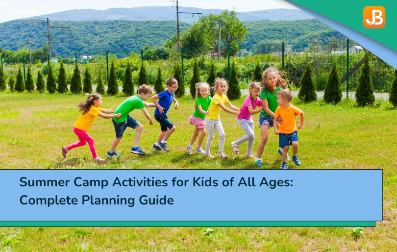
What Questions Should Your Camp Website Answer First?
Before parents register—or even reach out—they are scanning for answers. And search engines reward websites that clearly and directly address those questions. These are the 10 questions your camp website should answer upfront to build trust, improve visibility, and support faster decisions.
1. How do you promote summer camps on a website?
List programs by age, date, and location. Use real photos, parent testimonials, and clear calls to action. Optimize for local SEO so families can find you quickly.
2. How do you get people to come to your camp with a website?
Create a site that is informative, visually engaging, and easy to navigate. Pair it with social campaigns, email series, and landing pages tailored to specific interests.
3. What makes a great summer camp page?
Mobile-first layout, fast load times, authentic photos, session-specific details, and a visible “Register Now” button near the top of the page.
4. What increases summer camp registration quickly?
Early-bird discounts, urgent CTAs (“Only 5 spots left!”), Simple forms and retargeting ads to follow up with visitors who did not complete the sign-up.
5. How can a camp website build parent trust?
Show clear safety protocols, staff bios, refund policies, and real reviews. Transparency lowers hesitation and boosts confidence.
6. What content should every camp website include?
Program details, pricing, calendars, FAQs, contact info, photo/video galleries, and safety and staff pages. Bonus: a “Start Here” page for new families.
7. Why do parents abandon camp registration forms?
Too many fields, unclear pricing, no mobile optimization, or no confirmation at the end. Simplifying the process is key.
8. How can you improve your camp website’s performance?
Use analytics tools to track behavior. Heatmaps, A/B tests, and funnel dashboards help identify where users drop off and pinpoint areas for improvement.
9. What’s the role of digital marketing for camp enrollment?
It supports your website by driving traffic from email, social media, and paid ads, especially during key enrollment periods.
10. How does SEO help families find your camp?
SEO puts your camp in front of the right people at the right time—especially when optimized for terms like “summer camp near [city]” and program-specific keywords. If your website can answer these questions clearly and quickly, you will reduce confusion, gain trust, and convert more visits into registrations, both from parents and from search engine traffic.
Wrap Up
If your goal is to increase summer camp registration with the website you already have, the path is clear: meet parents where they are, answer their questions before they ask, and make it easy to take the next step.
Here’s what we covered in this guide:
- What parents look for first, on mobile, and under pressure
- How design, content, and trust work together to convert interest
- The role of SEO and digital marketing in reaching local families
- Where friction hides in your registration flow—and how to remove it
- Why measuring behavior helps you improve what matters most
If you missed a section, scroll back—each one offers practical steps to improve your site and increase enrollments.


4 thoughts on “How to Increase Summer Camp Registration with Your Website”
I visited a lot of website but I think this one has something extra in it in it
Wonderful web site Lots of useful info here Im sending it to a few friends ans additionally sharing in delicious And obviously thanks to your effort
Thanks for sharing your thoughts.
Hmm is anyone else experiencing problems with the pictures on this blog loading? I’m trying to figure out if its a problem on my end or if it’s the blog. Any feedback would be greatly appreciated.