An effective event registration landing page design communicates value clearly and leads visitors to take action without hesitation. The best pages focus on clarity, relevance, and ease — presenting information simply, reducing friction, and turning interest into confirmed registrations.
This guide breaks down the core components of a high-performing landing page, including layout, messaging, forms, visuals, and optimization techniques. It also shares real event registration landing page examples that show how thoughtful design decisions can enhance user experience and increase signups.
What Is an Event Registration Landing Page?
An event registration landing page is a focused digital space built to promote a specific event and capture signups efficiently. Its purpose is simple: turn interested visitors into confirmed attendees by presenting only the most relevant information and a clear path to register.
Unlike a general event page or a website’s homepage, this type of page removes unnecessary navigation and distractions. Every component — from the headline and visuals to the registration form — works together toward a single goal: encouraging sign-up.
What makes these pages distinctive is their precision. Each element is intentional, designed not just to inform but to motivate action. Whether the event is online or in-person, a well-crafted registration page is often the deciding factor between casual interest and actual attendance.
Why Good Design Matters for Event Registration Landing Pages
Visitors decide in seconds whether your event is worth their time — and design drives that decision. A clean, focused layout builds trust. Visual clutter or confusion creates doubt and drop-off.
Design isn’t just decoration. It affects how people perceive your event, how quickly they understand the value, and whether they feel confident registering.
A well-designed event registration landing page delivers:
- Strong first impressions
- Clear, fast communication
- A sense of credibility
- Higher conversion rates
It keeps attention where it belongs — on the decision to sign up. Design guides the eye, removes unnecessary choices, and makes the path to registration feel easy and obvious.
People abandon event registration forms when the page feels overwhelming, unclear, or difficult to navigate. Even motivated visitors will leave if the experience doesn’t feel smooth and trustworthy. Good design keeps them engaged, informed, and ready to register.
How Should You Structure the Layout and Flow?
An effective layout follows a clear sequence: present the event, highlight its value, guide users with calls-to-action, and finish with the registration form.
Below is a five-step framework for creating a focused, conversion-ready event registration landing page layout:
1. Start with a Clear Event Overview
Open with a headline that defines the event and explains why it matters. Add a short subheading or summary for quick context.
2. Highlight Key Benefits and Details
Before asking users to register, outline what they’ll gain — key takeaways, speakers, or agenda highlights.
3. Position Calls-to-Action Strategically
Place the first CTA above the fold and repeat it after major sections. Use action-oriented text and ensure buttons stand out visually.
4. Maintain a Clean, Linear Layout
Stick to a single-column design with ample white space. Avoid sidebars or distracting elements that pull attention away from registration.
5. Conclude with the Registration Form
End with the form or a final CTA once the event’s value is clear. Keep fields to a minimum to make signup quick and simple.
A structured layout keeps users focused, reduces hesitation, and makes the registration process straightforward.
What Copy and Messaging Convert Best?
Effective messaging communicates value clearly and motivates visitors to register. Each element should be direct, relevant, and easy to understand. Here’s how to write messaging that converts:
Write a Headline with Purpose
Lead with a clear headline that explains what the event is and why it matters.
- State the main value or benefit upfront.
- Keep it simple and specific.
A focused headline sets the tone and builds interest fast.
Emphasize Benefits and Takeaways
Show what attendees will gain by joining.
- Highlight key outcomes, speakers, or experiences.
- Use short, outcome-driven bullet points.
People register when they see what’s in it for them.
Add Social Proof to Build Credibility
Use real examples to show the event’s value.
- Add short testimonials or attendee quotes.
- Display sponsor or brand logos.
- Mention success metrics from past events.
Social proof builds trust and reduces hesitation.
Create a Sense of Urgency
Encourage quick decisions without sounding pushy.
- Mention deadlines like “Early bird pricing ends Friday.”
- Highlight limited spots or time-sensitive offers.
- Use countdowns where relevant.
Urgency gives visitors a reason to act now.
Use Clear, Action-Oriented CTAs
Make it obvious what to do next.
- Keep button text short and direct: “Register Now,” “Save Your Seat.”
- Avoid vague phrases like “Learn More.”
Clear CTAs guide visitors through the registration process.
Purposeful copy keeps your event registration landing page focused, persuasive, and easy to act on—turning interest into confirmed signups.
How to Optimize the Form and Reduce Friction
A seamless registration experience should be quick, intuitive, and free of unnecessary obstacles. Small improvements here can significantly increase conversions, and key ways to reduce these barriers include:
- Keep fields minimal – Ask only for essentials like name, email, and ticket type
- Use optional fields wisely – Make noncritical questions optional or skip them entirely
- Consider multi-step forms – Break long forms into manageable steps, especially for mobile users
- Design mobile-first – Use responsive layouts, large tap targets, and auto-fill where possible
- Validate fields in real time – Help users correct errors immediately without starting over
- Remove distractions near the form – No pop-ups, extra links, or competing calls-to-action
The goal is to make completing the form feel fast and effortless — not like a chore.
For most events, 3 to 5 fields are ideal. It strikes the right balance between capturing necessary information and keeping visitors engaged through completion.
What Visuals and Interactive Elements Improve Engagement?
The right visuals answer key questions the moment someone lands on your page — what the event is, who it’s for, and whether it feels credible. When those answers are clear at a glance, visitors are more likely to stay, explore, and register.
To make your event landing page more engaging and easier to navigate, include:
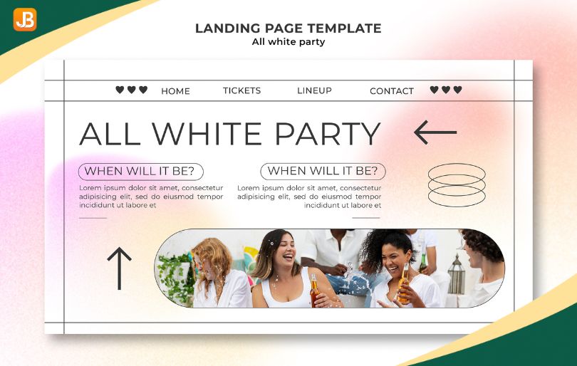
- High-quality, relevant images – Use photos from past events, speakers, or attendees. Authentic visuals build trust. Avoid generic stock photos.
- Real people – Show speakers, instructors, or team members to make the event feel more relatable and personal.
- Previews of the experience – Share a visual agenda, venue photos, or session highlights so visitors can picture what they’ll get.
- Short videos (if helpful) – A 30–60 second highlight or testimonial video adds energy and context. Never autoplay.
Interactive elements that guide – Use expandable bios, scrollable schedules, or hover effects to add detail without clutter. - Countdown timers (only when real) – Use them for genuine deadlines, like early-bird pricing or registration closing.
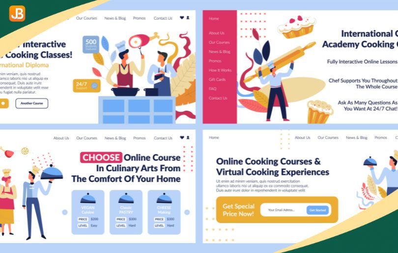
- A consistent visual style – Stick to one font family, color palette, and layout system. A clean, cohesive look supports clarity and professionalism.
Real, relevant visuals paired with simple interactive features create a better user experience, help visitors understand the event faster, and increase the likelihood they’ll register.
How to Boost Conversions
Getting visitors to register often comes down to small, strategic changes. Optimizing your design, copy, and user experience can significantly increase signups without a full redesign.
To improve conversions, focus on:
- High-contrast, action-oriented CTAs – Make buttons visually distinct and use clear, specific language like “Register Now” or “Save Your Seat.”
- A/B testing layout and messaging – Test headlines, CTA placement, supporting copy, and visuals to learn what performs best.
- Exit-intent popups or reminders – Prompt visitors before they leave with limited-time offers or gentle signup nudges.
- Social proof near decision points – Place testimonials, past attendee quotes, or partner logos close to CTAs and forms.
- Urgency and scarcity – Highlight real deadlines, limited seats, or early-bird pricing to drive faster decisions.
The most effective conversion tactics combine clear calls to action, visual emphasis, real-time proof, and time-sensitive motivators — all focused on removing hesitation and encouraging action.
Event Registration Landing Page Examples That Work
Seeing real-world examples is one of the fastest ways to understand what works — and why. The table below shows how leading organizations use design, copy, and structure to drive conversions.
| Example | Key Design Features | Notable Conversion Elements |
| Web Summit | CTAs are repeated throughout the page. Clear registration options are always visible. | Smooth, responsive experience. Visual energy encourages exploration. |
| Adobe MAX | Dynamic hero section with animated visuals.Interactive filters for sessions and speakers.Consistent, mobile-friendly layout. | Bold headline and real-time countdown timer create urgency. Clean, scroll-friendly layout. Speaker visuals and benefit-focused copy communicate value quickly. |
| MozCon | Sticky registration button keeps CTA in view . Seamless signup experience. | Bold headline and real-time countdown timer create urgency.Clean, scroll-friendly layout. Speaker visuals and benefit-focused copy communicate value quickly. |
Each example shows that clear structure and smart design turn interest into action.
To find more event registration landing page examples, look through platforms like Eventbrite, Cvent, or Meetup — where you can browse hundreds of real event pages across industries. Pay attention to how top-performing pages use headlines, visuals, social proof, and calls to action to guide users toward registration.
How to Use Class Registration Software for Event Registration
Because many events follow a structure similar to classes — with sessions, schedules, or recurring formats — class registration software can also be a practical solution for event management. It simplifies setup, tracking, and communication, especially for multi-session or repeat programs.
Here’s how it supports event organizers effectively:
Benefits of a Unified Registration Platform
Using one system for both classes and events streamlines every part of the registration process.
- Combines session selection, capacity tracking, and payment processing in one place.
- Automates email confirmations, reminders, and updates for attendees.
- Provides reporting and analytics to measure performance and attendance.
- Reduces manual work for recurring or multi-session events.
Tips for Integrating Class Registration Tools into Events
To make the most of class registration software for event signups:
- Customize registration modules for different ticket or session types.
- Automate confirmation emails, reminders, and post-event follow-ups.
- Connect payment gateways and attendee tracking for a smooth workflow.
- Reuse saved templates for similar or recurring events.
Jumbula’s class registration software offers all these capabilities and more, including built-in scheduling tools, secure online payments, waitlist management, and automated communication workflows. It provides an organized, time-saving way to manage signups, automate tasks, and maintain consistency across both class-based and event-style programs.
Wrap Up
Your event registration landing page isn’t just a form — it’s a decision-making tool. Every part of the page, from headline to button, should help visitors understand the offer and take action without hesitation.
For many organizers, especially those running seasonal programs, workshops, or recurring sessions, using class registration software is a smart move. Jumbula, while designed for class and camp management, also supports special event registration workflows — including scheduling, payment collection, waitlists, and automated confirmations. Its flexible pricing is based on usage and features, so it scales with your needs.
FAQ
What makes an event registration landing page effective?
Clarity, trust, and focus. The page should explain the value of the event, build credibility, and guide visitors to register with minimal friction.
How long should the page copy be?
There’s no fixed word count, but 300–600 words is typical — long enough to communicate value but concise enough to hold attention.
Should I include multiple links or just one?
Limit links. Too many options dilute focus. One clear call-to-action is best, with supporting links only when necessary.
How can I make mobile registration seamless?
Use a mobile-responsive layout, large tap targets, autofill-enabled forms, and a simple structure that minimizes scrolling and field fatigue.


16 thoughts on “Event Registration Landing Page Design: Best Practices and Examples”
Very interesting details you have remarked, thanks for putting up.
Thanks so much! I’m glad you found the details interesting.
You covered all the points perfectly. Great job!
We’re grateful for your kind message. It’s encouraging to hear it was worthwhile.
Great insights!
We greatly value your feedback and are pleased the blog served you well.
Thanks for the practical tips! Do you think this approach will stay relevant for the foreseeable
future?
Your feedback means a lot—thank you for your support.
I forwarded this post to my colleagues. It’s too good to keep
to myself!
We appreciate your warm feedback. It’s always rewarding to know our efforts were meaningful.
Awesome content! Do you think this approach works for people just starting out?
You’re most welcome.
I enjoy what you guys tend to be up too. Such clever work and coverage!Keep up the superb works guys I’ve incorporated you guys to our blogroll.
We sincerely thank you for your appreciation—it motivates us to continue doing our best.
Your blog is a treasure trove of knowledge! I’m constantly amazed by the depth of your insights and the clarity of your writing. Keep up the phenomenal work!
Thank you! We’re glad you enjoyed the content.