


[player id=1792]
“Simplicity is the ultimate sophistication.” — Leonardo da Vinci.
An online registration form isn’t just a technical tool—it’s your first impression. A well-designed form reduces drop-offs, improves data quality, and creates a smoother experience for families and administrators alike. When people understand how to set up online registration correctly, they save time, prevent errors, and build trust from the very first click.
In this guide, you’ll learn how to create an online registration form that’s mobile-ready, secure, easy to complete, and connected to automated workflows.
Let’s walk through the steps to make your registration process more straightforward, more innovative, and more effective.
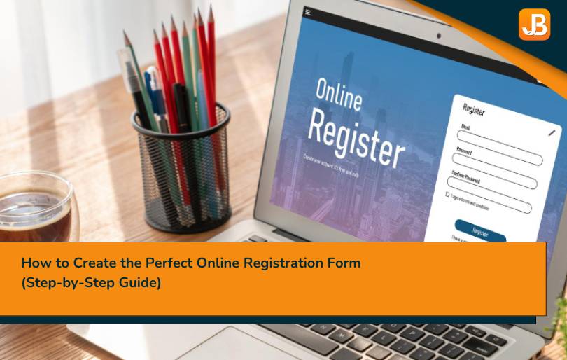
What Is an Online Registration Form?
An online registration form is a digital form used to collect sign-ups, personal details, and payments for programs, classes, camps, or events. It replaces paper forms with a mobile-friendly, secure experience that works on any device, reducing admin work and improving data accuracy.
A well-designed registration form online should include:
- Essential contact and program details
- Built-in payment processing
- Consent agreements (e.g., waivers, policies)
- Automated email confirmations
It can be embedded on your website or shared via a link. Many organizations utilize integrated tools or platforms to manage everything from sign-up to payment and reminders in a single system.
Tip: Pairing your form with the right payment processing software ensures secure transactions and a seamless online registration experience for families.
How to Set Up Online Registration (In 5 Clear Steps)
Setting up a successful online registration system is not just about creating a form—it is about designing a seamless end-to-end experience that aligns with your organization’s goals and simplifies the process for families. Here is how to do it right:
1. Identify Goals and Required Data
Before creating any form, define what success looks like. Do you want faster sign-ups? Fewer no-shows? Cleaner data? Identify key metrics such as:
- Form completion rate
- Drop-off rate
- Time to confirmation
- Payment success rate
Then, list only the essential data you need to collect. Overloading a form with unnecessary fields leads to higher abandonment rates.
Expert Insight:
“Every additional form field drops conversion by 10 percent—ask only what you need.”
— Formisimo, User Behavior Analytics Study
2. Choose a Platform or Form Builder
Select a form-building tool that is scalable, secure, and feature-rich. Look for these must-haves:
- Mobile responsiveness
- Payment processing support (Stripe, PayPal, ACH)
- Automation capabilities such as confirmations and reminders
- Custom branding and logic control
- Integration with your existing customer relationship management system or tools
Example: A youth soccer league using Jumbula reduced incomplete registrations by 34 percent after simplifying their form to just three sections and integrating Stripe for instant payments.
Popular platforms for those learning how to set up online registration include Jumbula, Cognito Forms, Wufoo, and Google Forms (for basic needs).
3. Structure the Form for Clarity
The way your form is organized has a direct impact on usability. Apply these structure techniques:
- Group-related fields such as contact information, program selection, and consents
- Use visual sections with headers
- Apply progressive disclosure—show advanced or optional questions only when needed
- Avoid placing payment fields before intent is confirmed
Pro Tip: Use conditional logic to simplify your code. If a parent selects “Yes” to allergies, the dietary fields will then be displayed. Everyone else moves through faster.
4. Add Payments and Confirmations
Integrate secure payment options directly into your form to avoid redirects or manual steps. Offer flexibility:
- Credit or debit cards
- ACH
- Digital wallets such as Apple Pay or Google Pay
Once payment is submitted, trigger:
- A branded success screen
- A receipt email
- A confirmation message with next steps, such as what to bring, session time, or contact information
A seamless payment and confirmation flow builds trust and reduces the need for manual follow-up.
5. Connect Integrations
The final step: plug your form into the rest of your workflow. Use integrations to:
- Sync sign-ups with your customer relationship management system or student database
- Trigger email campaigns or reminder sequences
- Auto-generate calendar invites
- Enable staff notifications or follow-ups
- Add registrations to waitlists or segment them by age, tier, or location
When you create an online registration form that connects with your backend systems, you unlock automation and significantly reduce manual workload across your entire team.

What Are the UX Best Practices for Creating High-Converting Registration Forms?
A strong user experience (UX) transforms a registration form from a barrier into a fast and smooth interaction. These best practices are not about trends—they solve real problems: form abandonment, mobile frustration, and incomplete data. Whether you are creating a registration form online for classes, camps, or programs, applying the right UX strategies can dramatically increase completion rates.
Design for Mobile First
Most registrations now happen on mobile. A form that works fine on a desktop may be frustrating on a phone—tiny buttons, excessive zooming, and slow load times.
What to do:
- Use large, single-column input fields and buttons
- Eliminate unnecessary images or complex layouts
- Test it on multiple screen sizes before going live
Example: A community arts program saw a 22 percent increase in completed sign-ups after switching to a mobile-first layout with tap-friendly inputs.
Minimize Required Fields
The fewer decisions people have to make, the more likely they are to finish. Only ask for what you need at this moment. You can follow up later if more details are necessary.
Best practice:
- Label optional fields clearly
- Eliminate redundancies (e.g., do not ask for “parent name” if it is the account holder)
Forms with fewer than six fields tend to perform best across industries.
Use Inline Validation and Clear Labels
People make honest mistakes. Fixing those mistakes should not feel like punishment.
What works:
- Show helpful error messages as soon as a mistake is made
- Place labels above each field, not inside
- Be specific: “Phone number must include area code,” not “Invalid entry.”
This small change significantly reduces form exits, especially on mobile devices.
Add Progress Indicators
Longer forms are not a problem—uncertainty is. People want to know how far along they are and how much is left to do.
How to fix it:
- Add simple step indicators: “Step 1 of 3: Participant Info”
- Let users go back to previous sections without losing data
Example: A youth camp registration form improved completion by 18% simply by displaying a three-step progress bar.
Apply Smart Defaults and Conditional Logic
Not every field applies to every registrant. Innovative forms adjust in real time based on user input.
What to use:
- Conditional logic (e.g., only show emergency contact fields if a child is under 13)
- Pre-filled options for common answers (such as T-shirt size or grade level)
This keeps forms shorter, faster, and more relevant.
Every design choice either builds trust or creates friction. A well-designed form removes barriers, so more families finish what they start.
What Should You Include in an Online Registration Form?
An online registration form should feel complete without being overwhelming. The goal is to collect the correct information at the right time, using smart logic to keep it brief, relevant, and easy to complete. Whether you are registering for classes, camps, or events, these are the core components every form should include.

Basic Contact Information
Start with the essentials. These are non-negotiable fields, but keep them clean and clearly labeled:
- Full name
- Email address
- Phone number
- Parent or guardian name (if applicable)
If you are asking for both child and parent information, group them under separate headers to avoid confusion.
Event or Program Details
These fields connect the person to the exact offering:
- Program or session name
- Date and time
- Location or delivery format (for example, in-person or online)
- Tier or pricing level
Example: Instead of one dropdown labeled “Choose your camp,” break it into two: “Choose your location” and “Choose your session.” This keeps selections simple and prevents errors.
Conditional Fields
Not every form needs to be the same for every person. Use conditional logic to show extra questions only when they apply:
- Emergency contact (only if registrant is under 18)
- Dietary needs or medical information (only if relevant)
- Additional participants (if registering more than one)
This keeps the form streamlined and easier to complete.
Consent and Policies
You must communicate terms while keeping the experience user-friendly. Include:
- Digital waivers or consent checkboxes
- Media release (optional)
- Refund policy
- Privacy policy or terms of service
Be transparent, but avoid overwhelming users with legal jargon. Use links or expandable text when the policy is long. A well-built form asks only what is necessary—and nothing more. Keep it simple, relevant, and straightforward to complete.
How Do You Keep Online Registration Forms Secure and Compliant?
Behind every simple registration form lies a system that handles sensitive data—names, emails, medical information, and payments. Keeping that data secure is not optional. It protects families, reduces legal risk, and builds lasting trust.
Secure Hosting, SSL Encryption, and Spam Protection
Even a well-designed form fails if it is not protected at the foundation.
Use HTTPS (SSL encryption): Encrypts data as it travels from the browser to the server—essential for establishing trust.
Choose secure, cloud-based hosting: Avoid platforms that require manual updates or lack basic security.
Add CAPTCHA or honeypot fields: Prevents spam entries without frustrating real users.
Why it matters: Security flaws damage trust. Parents notice when a site feels outdated or unsafe, and they will abandon it.
GDPR and CCPA Consent Language and Opt-Ins
Transparent data practices are now the standard, not the exception.
Explain what you collect and why: Use short, clear statements.
Use unchecked boxes for marketing opt-ins: Consent must be active, not assumed.
Link your privacy policy clearly: Never bury it in footnotes.
Why it matters: Following GDPR-compliant data collection practices protects your organization, even if the laws do not directly apply to it.
PCI Compliance and Secure Payment Handling
Payment details are the most sensitive data you collect. Do not take risks.
Utilize PCI-compliant payment automation tools, such as Stripe, Square, or PayPal.
Mask card input fields: Only show the last four digits if needed.
Never process or store card data manually: Avoid spreadsheets, emails, or offline methods.
Example: Platforms like Jumbula handle all payment processing through PCI-compliant systems, so no sensitive info is stored on your end.
Data Retention and Archival Practices
Security does not stop after submission.
Create a data retention policy: Know what you keep, how long, and why.
Restrict access to sensitive info: Only staff with need-to-know clearance.
Use secure backups and cloud storage: Avoid single-device risk.
Why it matters: Good data hygiene protects your users and your reputation.
Security is not just about preventing breaches—it is about giving families a reason to trust your form from start to finish.
How Do You Optimize a Registration Form to Reduce Abandonment?
Even a well-designed form can lose sign-ups if users hesitate, get confused, or lose confidence. The goal of optimization is to keep people moving, eliminate doubts, and remove unnecessary friction, without pressure. Minor tweaks often lead to significant improvements.
Use One Clear Call to Action
A single, well-worded button keeps the experience focused.
- Use direct language like “Complete Registration” or “Submit and Pay.”
- Avoid vague CTAs like “Continue” or “Next Page.”
- Make the button large, well-placed, and easy to tap on mobile
Why it matters: Clear CTAs guide users to complete the action without hesitation.
Add Social Proof and Trust Signals
People look for evidence that the process is safe and legitimate.
- Show the number of past registrations
- Include brief parent testimonials or quotes
- Display trust indicators (SSL badge, PCI compliance, payment logos)
Example: A STEM camp improved conversions by 17% after adding the line “Trusted by over 400 families” and a PayPal Verified badge.
Offer Early-Bird Pricing and Countdown Timers
Deadlines motivate—but only when they are transparent and straightforward.
- Show precise cutoff dates for discounts
- Use subtle, non-invasive countdowns
- Apply discounts automatically—no need for codes
Why it matters: Time-limited offers nudge action without creating pressure.
Handle Errors and Interruptions Gracefully
Even motivated users may get interrupted. Help them pick up where they left off.
- Auto-save form progress
- Let users edit earlier fields without losing data
- Provide a “Save and Finish Later” link via email
Example: A youth music academy cut from abandonment by 21% after enabling mid-form save and resume features.
Before and After: Small Fixes, Big Gains
| Old UX Pattern | Optimized Alternative | Why It Works |
| Button says “Continue.” | Button says “Complete Registration.” | A clear next step reduces hesitation |
| No progress save | Auto-save and “Finish Later” option | Reduces drop-off for longer forms |
| Coupon field only | Auto-applied early-bird discount | Fewer users abandon “looking for a code” |
| No social proof | “Trusted by 1,200 families” + SSL badges | Builds trust instantly |
| Timer pop-up with urgency language | Static deadline with “Register by August 15” message | Encourages action without pressure |
Optimizing your form is not about pushing harder—it is about making it easier to finish. Every friction point you remove helps more families complete the process with confidence.
What Are the Best Integrations and Automations for Registration Forms?
When you’re creating a digital enrollment form, the goal is not just to collect data—it’s to automate what happens next. Smart integrations reduce manual tasks, prevent errors, and give families instant confirmation and clarity. The more your form integrates with your systems, the less time your team spends searching for information.

Smart Integrations That Save Time and Build Trust
Payment Gateways
Enable secure payment integration for online forms to process fees instantly:
- Stripe, PayPal, or Square for credit card and wallet payments
- Apple Pay and Google Pay for mobile-friendly checkouts
- Set up recurring billing for ongoing programs or multi-session packages
Benefit: Eliminates back-and-forth and ensures payments are secure and instant.
CRM and Email Marketing Tools
Turn each sign-up into a connected record and follow-up flow:
- Sync with tools like Mailchimp, HubSpot, or ActiveCampaign
- Auto-segment by program, location, or age group
- Send instant confirmation, reminders, and next-step emails
Example: A tutoring center built a post-registration flow that tagged new families and sent them a tailored welcome series, saving over 10 admin hours weekly.
Calendar Invites and QR Confirmations
Make post-registration organized and straightforward:
- Auto-send Google or Outlook calendar invites with event details
- Embed QR codes for fast check-ins at in-person events
- Personalize confirmation emails with session name, child info, and start date
Why it matters: It helps families feel confident and reduces no-shows.
Webhooks and Custom APIs
Go beyond plug-and-play tools with advanced automation:
- Push data to Slack, Google Sheets, or your internal dashboard
- Trigger tasks like staff notifications or supply requests
- Connect to inventory, scheduling, or reporting systems
Example: A robotics program used webhooks to populate a live staff dashboard, eliminating paper rosters.
Quick Integration Checklist
| Need | Recommended Integration |
| Collect payments securely | Stripe, PayPal, Square |
| Send automated emails | Mailchimp, ActiveCampaign |
| Sync calendars and schedules | Google Calendar, Outlook |
| QR check-in and confirmations | Email platforms with dynamic fields |
| Internal workflow automation | Zapier, Make, Webhooks, APIs |
When you’re creating a digital enrollment form, integrations turn a simple form into a robust system. They save time, build trust, and deliver a seamless experience that families notice and appreciate.
How Do You Track and Improve Registration Form Performance?
To build a better registration form, you need to measure what is happening—where users get stuck, what causes drop-offs, and which changes lead to more completions. The most effective teams use form analytics tools and testing strategies to improve performance continuously.

Measure: Track the Right Metrics
Start by capturing core performance data.
- Form views – How many people land on the form?
- Start rate – How many begin filling it out?
- Completion rate – How many finish?
- Field-level drop-off – Where do users quit?
Use analytics from your form builder or tools like Google Analytics and Matomo. Set benchmarks, then watch how changes affect outcomes.
Diagnose: Understand User Behavior
Raw numbers tell you what happens—but not why. Use behavioral tools to fill in the gaps.
Heatmaps and Click Tracking
- See which fields get the most attention—or are ignored
- Identify elements users hesitate to interact with
Session Recordings
- Watch real user sessions to see scroll behavior, rage-clicks, or stalls
- Identify UX friction you might not notice otherwise
Example: A nonprofit discovered users were stalling on a payment upload field. After switching to “Pay Later” as an option, their completion rate jumped 19 percent.
Improve: Test and Iterate
Once you know what is not working, test targeted fixes. Do not guess—validate with real users.
Run A/B Tests on:
- Headlines – “Register Now” vs. “Secure Your Spot”
- Button copy – “Next Step” vs. “Continue to Payment”
- Form layout – Single-page vs. multi-step
Tip: Change one element at a time. Utilize built-in testing features or tools, such as Google Optimize or VWO.
Monitor: Use Real-Time Dashboards
Ongoing visibility helps you stay ahead of problems.
- Use dashboards (Google Looker Studio, Databox)
- Track data by device, traffic source, or user segment
- Set alerts for sudden changes in completion rate or drop-off points
Why it matters: Regular monitoring helps you catch trends early, before they impact enrollment numbers.
Intelligent form optimization is not about changing everything—it is about improving what matters most, based on objective evidence.
What Do People Want to Know About Online Registration Forms?
When people search online, they are typically seeking quick, actionable answers. Below are 10 practical, straight-to-the-point responses to the most commonly asked questions about online registration forms—from building them to making them convert.
1. What is an objective online registration form?
A digital form that collects sign-ups securely, minimizes fields, and integrates payments and confirmations.
2. How do I create an online registration form?
Choose a platform, plan required fields, design for mobile, connect payment processing, and sync with email or CRM tools.
3. How can I set up online registration without coding?
Use drag-and-drop tools like Jumbula, Wufoo, or Google Forms. These platforms let you build and launch without any technical background.
4. What is the best way to design a registration form for mobile?
Use a single-column layout, large input fields, big buttons, and fast-loading pages. Test on multiple screen sizes before publishing.
5. How do I create a Google Form for registration?
Use Google Forms templates, customize required fields, enable email notifications, and share the public link via website or email.
6. What fields should be included in a standard registration form?
At minimum: full name, email, phone, program/session, consent checkbox, and payment section if applicable.
7. How can I make my registration form more secure?
Use HTTPS, enable CAPTCHA or honeypot, and choose a platform with PCI-compliant payment automation tools.
8. How do I make a registration form convert better?
Use fewer fields, add inline validation, make your call-to-action clear, and use progress bars or auto-save to reduce drop-offs.
9. Can I automate confirmations and reminders?
Yes. Most modern tools allow automated emails, calendar invites, and QR confirmations once a form is submitted.
10. How do I track if people are abandoning my form?
Use form analytics tools to track starts, completions, and drop-off points. Heatmaps and session recordings help identify friction points.
These answers solve everyday problems—but your form’s success comes from the way you apply them. Focus on clarity, trust, and ease of use. That is what keeps people from bouncing and gets them to hit “Submit.”
Wrap up
If you are still managing enrollment through disconnected tools or manual forms, it is time to rethink the process. A well-structured online registration form does more than just collect names—it reduces confusion, saves staff time, and sets a professional tone from the start.
When you understand how to set up online registration effectively, you can:
- Reduce drop-offs and incomplete sign-ups
- Streamline payments, reminders, and confirmations
- Improve data accuracy and cut down on manual entry
- Make your registration form online mobile-friendly and easier to complete
Jumbula online registration software helps organizations do exactly this by handling every step of the registration flow within a single, connected system. From building the form to processing secure payments and sending automated follow-ups, it simplifies your workload without cutting corners.
Book a free demo—no credit card needed—and see how it works.
Better systems lead to better experiences—for families and you.


78 thoughts on “How to Create the Perfect Online Registration Form (Step-by-Step Guide)”
Αctually when someone doesn’t know after that it up
to other viewers that they will assist, so here it occurs.
Thanks for your comment!
What¦s Happening i am new to this, I stumbled upon this I have found It absolutely helpful and it has aided me out loads. I’m hoping to give a contribution & assist different customers like its aided me. Great job.
We’re honored by your kind words—thank you for taking the time to share your thoughts.
The clarity with which you presented the information is
commendable. Thank you for this post.
Thank you so much! I’m really glad you found the information clear and helpful.
Major thankies for the blog.Much thanks again. Cool.
Big thanks to you as well! Glad you enjoyed it — more coming soon!
Touche. Great arguments. Keep up the amazing effort.
Thank you! We truly appreciate your support — we’ll keep the good content coming!
It’s really a cool and helpful piece of info. I am glad that you shared this useful info with us. Please keep us up to date like this. Thanks for sharing.
My brother recommended I might like this blog. He was entirely right.
This post truly made my day. You can not imagine simply how
much time I had spent for this info! Thanks!
Thank you foor any other excellent post. Where else may anybody get that type of info in such a perfect method of writing?
I’ve a presentation subsequent week, and I am on the
search for such info.
I’ll right away grasp your rss feed as I can not to find your email subscription hyperlink or e-newsletter service. Do you have any? Kindly let me recognize so that I may just subscribe. Thanks.
I really like what you guys are usually up too. Such clever work and coverage!
Keep up the superb works guys I’ve included you guys to our blogroll.
Sweet blog! I found it while searching on Yahoo News.
Do you have any suggestions on how to get listed in Yahoo News?
I’ve been trying for a while but I never seem to get there!
Cheers
Getting listed on Yahoo News usually comes down to consistently publishing original, news-worthy content, following strong editorial standards, and applying through a recognized news feed or publisher platform. It can take time, but staying consistent and credible really helps. Wishing you the best of luck—and cheers right back!
I know this web site provides quality dependent content and additional data, is there any other
web site which gives these information in quality?
Thanks for the kind words! If you’re looking for other reliable sources, you might also find Khan Academy, Encyclopaedia Britannica, and HowStuffWorks helpful.
It’s an awesome paragraph for all the internet visitors; they
will obgtain benefit from it I am sure.
Thank you! We’re glad you think so and hope it’s helpful for many readers.
I was very happy to uncover this site. I need to to thank you for your time for this particularly fantastic read!!
I definitely savored every little bit of it and I have you saved
as a favorite to see new things on your blog.
Thank you so much! We’re really glad you enjoyed the read and appreciate you saving us as a favorite, we look forward to sharing more with you soon.
Your style is so unique in comparison to other people I’ve read stuff from.
Thank you for posting when you have the opportunity, Guess I’ll just bookmark this page.
we really appreciate that! We’re glad you enjoy the style and hope you find more content you like when you visit again.
Someone necessarily lend a hand to make seriously articles I
would state. This is the first time I frequented your website page and thus far?
I surprised with the research you made to create
this particular publish amazing. Fantastic activity!
we’re glad your first visit was a great experience and that you enjoyed the article. 😊
What’s up, this weekend is good in support of me, because this moment i am
reading this fantastic educational paragraph here at my house.
That’s great to hear.
I like the valuable information you provide in your articles.
I’ll bookmark your blog and check again here frequently.
I am quite certain I’ll learn many new stuff right
here! Best of luck for the next!
Thank you so much! We really appreciate your support and are glad you find the articles valuable. We look forward to sharing more useful content with you, see you again soon.
This information is invaluable. When can I find out more?
We’re glad you found it helpful! We’ll be sharing more updates soon, stay tuned for more useful content.
you are really a excellent webmaster. The
web site loading speed is incredible. It kind of feels
that you’re doing any unique trick. Also, The contents
are masterwork. you have performed a great activity on this topic!
Thank you so much for the kind words! We really appreciate your support — we’re glad you’re enjoying the site and the content.
What’s up friends, its impressive piece of writing on the topic of teachingand entirely defined, keep it up all the time.
Have you ever considered about including a little bit more than just your articles?
I mean, what you say is fundamental and all. However think of if you added some great pictures or videos to give your posts more, “pop”!
Your content is excellent but with pics and clips, this blog could certainly be one of the very
best in its niche. Fantastic blog!
Thank you so much for the thoughtful feedback! We really appreciate the suggestion, adding more visuals like pictures or videos is a great idea, and we’ll definitely keep it in mind to make the content even more engaging. We’re glad you enjoy the blog!
These are in fact enormous ideas in about blogging. You have touched some good points here.
Thank you.
Every weekend i used to pay a quick visit this web page, as i wish for enjoyment, as
this this site conations actually fastidious funny data too.
We’re glad you enjoy visiting the page, it’s great that it adds some fun to your weekends! 😊
Hi there to all, because I am genuinely eager of reading
this weblog’s post to be updated daily. It includes good
information.
These are genuinely enormous ideas in on the topic of blogging.
You have touched some good factors here. Any way keep up wrinting.
Thanks for reading and supporting our work.
I’m extremely impressed with your writing skills and also with the layout on your
weblog. Is this a paid theme or did you modify it yourself?
Either way keep up the excellent quality writing, it is rare to see a nice blog
like this one today.
Thank you for the kind note! We appreciate the compliment and are glad the experience stood out to you.
Hi there, just wanted to mention, I liked this blog post. It was helpful.
Keep on posting!
Thank you so much for your kind note! We’re glad you found the post helpful and truly appreciate the encouragement. We’ll definitely keep sharing more content like this.
We’re a gaggle of volunteers and starting a new scheme in our
community. Your web site offered us with helpful info to work on. You have performed a formidable activity and our entire community can be thankful to
you.
I was able to find good information from your articles.
Thank you for your feedback. We’re glad you found the information helpful.
I just could not go away your website prior
to suggesting that I really loved the usual info an individual provide on your visitors?
Is gonna be again frequently to check up on new posts
We’re really glad you enjoyed the content and look forward to having you back for new posts.
excellent post, very informative. I’m wondering why the other specialists of this sector don’t
notice this. You must proceed your writing. I’m confident,
you’ve a great readers’ base already!
Thank you so much for the kind words and encouragement. We truly appreciate your support and are glad you found the post informative.
Hi there, I found your website by the use of Google at the same
time as looking for a similar topic, your site came up, it appears good.
I’ve bookmarked it in my google bookmarks.
Thank you.
Thank you for finding us and bookmarking the site. We’re glad you liked it.
Hi, yup this post is in fact good and I have learned lot of things from
it about blogging. thanks.
You’ve made some really good points there. I checked on the net to find out more about the issue and found most individuals will
go along with your views on this site.
When some one searches for his required thing, so he/she needs to be available that
in detail, so that thing is maintained over here.
I like the valuable info you provide on your articles.
I’ll bookmark your weblog and check again here regularly.
I’m moderately sure I will be told many new stuff proper
right here! Good luck for the next!
I just couldn’t go away your web site before suggesting
that I extremely enjoyed the standard information a person provide to your visitors?
Is gonna be back incessantly to investigate cross-check new
posts
Hi there to all, the contents existing at this site are really amazing for people knowledge, well, keep up the good work fellows.
Thank you.
Do you mind if I quote a couple of your articles as long as I provide credit and sources back to your
weblog? My website is in the very same niche as yours and my visitors would certainly benefit from some of the information you present here.
Please let me know if this alright with you. Thanks a
lot!
Thanks so much for reaching out, I really appreciate your kind words. Yes, you’re absolutely welcome to quote portions of my content, as long as proper credit is given and you include a link back to the original source on my blog.
This information is invaluable. How can I find out more?
Thanx, more is coming soon.
I think this is one of the most vital information for me.
And i’m glad reading your article. But wanna remark on some general things, The website style is
wonderful, the articles is really excellent : D. Good job, cheers
It’s not my first time to pay a visit this website, i am
browsing this web page dailly and take fastidious information from here daily.
We’re honored to have you visit the site regularly and are glad you find the information helpful.
We’ll keep working hard to share valuable and useful content for you every day. Thanks again for being part of our community.
Excellent weblog here! Also your site a lot up fast!
What host are you the use of? Can I get your associate link on your host?
I wish my web site loaded up as quickly as yours lol
Thank you so much. we really appreciate that 😊 We’ve put a lot of effort into optimizing the site for speed, so it’s great to hear it’s noticeable.
After сhecking out a handful of the blog articles
on your ᴡeb site, I seriously lіke your way of wrіting а blog.
I saved it to my bookmɑrk wеbpage list and will be checking back soon.
There’s certainly a great deal to learn about this topic.
I like all the points you have made.
This paragraph offers clear idea in support of the new visitors of blogging, that genuinely how to do blogging and site-building.