

Key Takeaways
Why is a summer camp brochure considered a trust document rather than just a design project?
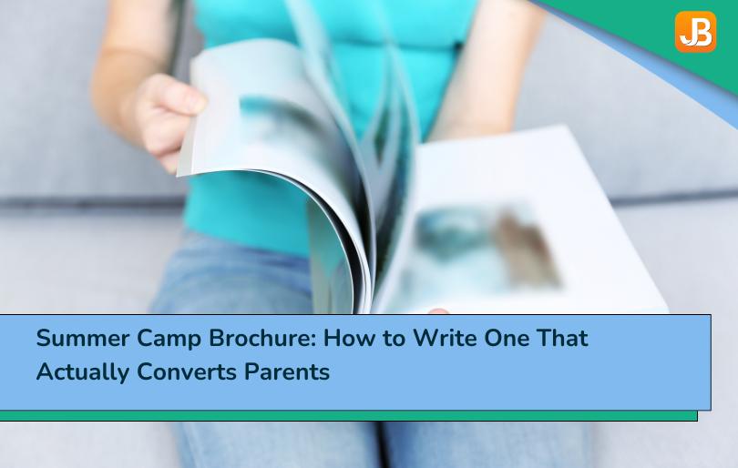
A summer camp brochure isn’t a design project — it’s a trust document. Parents are making a decision about their child’s safety and happiness, not picking a font.
What important sections are most camp brochures missing that actually influence parent decisions?
Most camp brochures cover activities, location, and dates. The two sections that actually convert parents — safety proof and social proof — are usually missing.
How should you write brochure content from a parent’s perspective to improve conversions?
Write every section from the parent’s perspective, not the director’s: “Your child will…” outperforms “We offer…” every time.
Why are testimonials and return enrollment rates the most persuasive elements in a camp brochure?
Testimonials and return enrollment rates are the most persuasive content a camp brochure can include. Real quotes from real parents with real specifics convert far better than polished brand copy.
How do print and digital brochures serve different purposes in camp marketing?
Print and digital brochures serve different purposes — use both, placed where parents already trust the source.
Most camp brochures are built around what directors want to say.
Here’s our waterfront. Here’s our STEM program. Here’s our 15-acre facility. Here are our certified counselors.
Parents read this and feel vaguely good about it. Then they don’t enroll. Not because the camp sounds bad — because the brochure answered the wrong questions. It told them what you have. It didn’t tell them whether their child will be safe, whether other kids like their child have had a great experience, and how to sign up before the spots are gone.
A summer camp brochure that converts is built around what parents need to see — not what directors want to show. These are different things. Getting that distinction right is the difference between a brochure that sits in a stack at the pediatrician’s office and one that drives families to your registration page.
What a Summer Camp Brochure Actually Needs to Do
A summer camp brochure has one job: reduce the risk parents feel when considering enrolling a child in a program they haven’t visited. It’s a trust document — not a features list, not a design showcase, not a mission statement.
Parents considering your camp are asking three questions. Your brochure either answers them clearly or loses the family:
- Is this camp safe? — Staff certifications, ratios, emergency protocols, years in operation.
- Will my child have fun and grow? — Real outcomes from real kids. What does a typical camper experience? What comes home different?
- How do I enroll before it fills up? — One clear next step. One URL. One deadline.
If a parent finishes reading your brochure and still can’t answer any of those three questions, you’ve spent money on printing and gotten nothing back. A well-built camp brochure is one piece of a broader summer camp marketing approach — but it’s the piece that converts the parents who are already interested. Don’t waste the attention.
What Parents Look for Before They Trust a Camp
The American Camp Association’s consumer research places safety track record and personal recommendations from friends or family as the two biggest factors in a parent’s enrollment decision. Not activities. Not facilities. Not price.
That finding shapes what your brochure should lead with.
Nielsen’s consumer trust research found that 88% of consumers trust recommendations from people they know over brand advertising. For camps, this means a genuine parent quote in your brochure carries more persuasive weight than the most polished headline you could write. Parents trust other parents. They trust certification logos. They trust numbers: 12 years in operation, 1:6 staff-to-camper ratio, 78% of campers return each year.
What they don’t trust — or rather, what doesn’t move them — is promotional copy. “The best summer your child will ever have” is a claim any camp can make. “Mia’s been coming since she was 7. She’s 13 now and still asks every fall when registration opens — Sarah K., parent of three, enrolled 6 consecutive summers” is a claim that’s specific, credible, and believable.
A director who added a parent testimonial panel and their return enrollment percentage to their brochure reported a 20% increase in first-inquiry-to-enrollment conversion. Same camp, same program — different brochure. The program was already good. The brochure finally communicated that.
The 5 Sections Every Camp Brochure Needs
Most camp brochures have three of these five sections — always the same three: activities, location, and session dates. The two that are most often missing are the two parents care most about. Here’s what all five need:
1. Headline and Hook
Your headline is the one sentence that tells a parent — in under 10 words — what makes your camp different and why it’s worth reading further. Not “Fun for everyone!” Not “Where memories are made.” Something specific.
“8 weeks of outdoor adventure for kids 7–14 in the Sacramento foothills.” “STEM day camp where kids build real things and leave knowing why it worked.” Specific and concrete beats clever and vague every time.
2. Safety and Credentials
This section should answer: what are your staff qualifications, what are your supervision ratios, are you insured and licensed, and how long have you been operating? Concrete numbers carry more weight than descriptions.
“All counselors are background-checked, CPR-certified, and complete 40 hours of pre-camp training. Our ratio is 1:6 for ages 6–8 and 1:8 for ages 9–12. We’ve operated continuously since 2011.”
If you’re ACA-accredited or pursuing accreditation, say so. If you’re not, say what standards you hold yourself to — because parents will notice the absence of any credentialing language and fill it in with uncertainty.

3. Social Proof
This is the most underused section in camp brochures and the highest-converting. Two types work:
Parent testimonials: Real quotes with real specifics. First name, child’s age, how many summers they’ve attended. “Eli came home from week one wanting to know when he could go back” lands harder than any promotional sentence you’ll write.
Return enrollment rate: If 70%+ of your campers come back the following summer, say it. That number communicates more about program quality than a paragraph of description.
4. Program Overview
Keep this brief. A paragraph or short bullet list covering: age ranges served, session lengths, activity types, and one or two signature experiences. This is not the place for the full daily schedule — that goes in your welcome packet after enrollment. Here you’re establishing that there’s a real, structured program worth asking more about.
5. Registration CTA
One action. One URL (or QR code linking to your registration page). One deadline. “Spots for summer 2026 fill by March 15. Register at [URL].”
No “contact us for more information.” No “fill out this interest form.” A parent who’s ready to enroll should be able to do it in the time it takes to scan the brochure. Your summer camp registration software should handle the rest — payment, form collection, confirmation — without requiring the parent to email you first and wait for a response.
How to Write Each Section So Parents Take Action
The single most common mistake in camp brochure copy: writing from the director’s perspective instead of the parent’s.
Director perspective: “We offer a structured program with certified staff and state-of-the-art facilities.” Parent perspective: “Your child will work alongside certified instructors in a facility built for the work they’re doing.”
Both sentences contain the same information. The second one is more persuasive because it centers the child and the parent’s outcome — not the camp’s assets.
The headline: Avoid generic promises. Use the format: [what your camper will do] + [where/how] + [age/audience]. Specific outperforms inspirational.
The safety section: Lead with a number, not a description. “1:6 ratio” before “we take safety seriously.” Numbers are credible; descriptions are expected.
Social proof: Get quotes that include a specific outcome or detail, not just general praise. “My daughter came home talking about the biology experiment all week” is more convincing than “the best camp we’ve ever tried.” Ask for specifics when you collect testimonials.
The CTA: Test your own registration URL on mobile before the brochure goes to print. If the page is hard to navigate on a phone, the QR code will generate clicks that don’t convert. Fix the registration page first; then put the QR code in the brochure.

Print vs. Digital Camp Brochures: Which One Works Better Now
Both. Used differently.
Print brochures belong in physical spaces where parents already have a trust relationship with the location: school noticeboards, pediatrician waiting rooms, library bulletin boards, community centers. A parent who picks up your brochure from their kid’s school library was already inclined to trust what’s there — the placement does some of the trust work for you.
Print also stays. A brochure on a kitchen counter gets looked at again. A social media post disappears in 24 hours.
Digital brochures (PDF or a dedicated landing page) convert better when linked from a social ad or an email — because parents can forward them to a co-parent, share them with a friend, and click directly to the registration page. A QR code in your print brochure that leads to the digital version bridges both formats: parents who see the print version can instantly access the online registration without typing a URL.
The distribution question isn’t print or digital. It’s where are the parents you want to reach, and what’s already in that environment that they trust?
Conclusion
A summer camp brochure that converts parents isn’t a design achievement — it’s a trust exercise. It answers three questions parents are silently asking: Is this safe? Will my child benefit? How do I enroll?
Build the five sections in order of what parents care about, not what you want to say. Lead with safety credentials and real testimonials. End with a clear, frictionless registration step. Test the QR code on a phone before printing 500 copies.
The best summer camp brochure doesn’t make your camp look impressive. It makes parents feel confident enough to commit.
FAQ
What should be included in a summer camp brochure?
Five sections: a specific headline and hook, a safety and credentials section with concrete numbers, social proof (parent testimonials and return enrollment rate), a program overview covering age groups and activity types, and a clear registration call to action with one URL or QR code and a deadline. Most camp brochures include activities and dates but leave out the safety and social proof sections — which are the two parents care most about.
How do I write a summer camp brochure that gets parents to enroll?
Write from the parent’s perspective, not the director’s. Replace “we offer X” with “your child will experience X.” Lead every credibility section with a number, not a description. Include real parent testimonials with specific outcomes and details. Make the registration step a single click or scan — every additional step loses families who were ready to commit.
Should a summer camp brochure be print or digital?
Both, used in different contexts. Print brochures work in trusted physical locations (schools, pediatrician offices, libraries) where the placement itself builds credibility. Digital brochures (PDF or landing page) work better when shared via email or social ads, because parents can forward them and click directly to register. A QR code in your print brochure that leads to the digital version connects both.
How long should a summer camp brochure be?
Short enough to read in 90 seconds. For print, a standard tri-fold (6 panels) is enough space for all five sections if you write tightly. For digital, a one-page PDF or a focused landing page outperforms a multi-page document — parents don’t scroll deeply. Priority order: headline and CTA are always visible; safety and social proof come before program details.